To add portfolio item go to Portfolio > Add New. Specify the name of your project and click Save Draft. After saving you will be able to see additional area named Project Options, use it to specify extra information about your project.
Adding Images
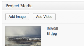 To add images find the Project Media box on the bottom of the project edit page. Click Add Image button. Media browser will open where you can select an existing images or upload a new ones. Choose an image and click Add Image(s) button.
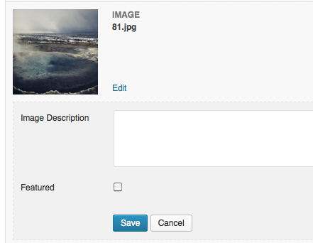
The image will be added to Project Media list. There you can further edit the image by entering image description which will get displayed on top of the image. Also you can specify the image to be featured. This means that the selected image should represent your project and it will get shown on horizontal and grid portfolios.
You can reorder the images and videos by simply dragging them in Project Media area.
Adding Videos
To add videos find the Project Media box on the bottom of the project edit page. Click Add Video button. An empty video item will be added to your Project Media list. Fill the Video Embed Code setting with embed code taken from YouTube or Vimeo and click Save. After saving Fluxus theme will try to recognize the embed code and show corresponding icon in the screenshot area. If that does not happen, check your embed code and make sure it looks like <iframe …></iframe>.
Project Options
Project Subtitle is displayed on top of project title. It can be useful for adding extra information to your project titles (e.g. Photography Series).
Project External Link is used to provide external link for your project (e.g. link to a magazine where this project is featured).
Project Information enables to add any amount of extra information related to the project. For example you can use it to give credits for calibration.
Feature Project Media Item
 To feature an image or video, find it in Project Media list and click edit. Check the Featured checkbox and click Save. Only one featured item per project is possible, so featuring an item will “un-feature” any other media items in that particular project.
Setting a video item as featured will require you to upload additional screenshot, which will be used on Horizontal and Grid portfolios instead of the video.
Note that if no item is selected as featured, then the first one will be used.
Project Media Order
To reorder your project images and videos simply drag them around in Project Media list.
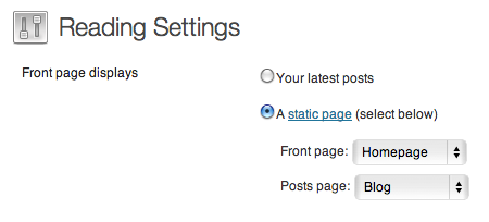
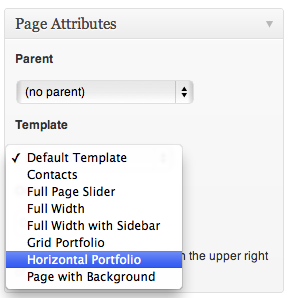 Create a new page by going to Pages > Add New, specify the name and locate Template select box. Select the template according to the type of Portfolio you would like to use (Horizontal Portfolio or Grid Portfolio). You can change it anytime. Publish the page and head to Portfolio section of this documentation to find out how to add portfolio items.
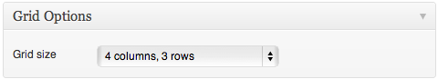 Arranges your projects in a predefined grid. If you have less projects than 12, you might want to use a bigger grid. You can change the grid size by going to Pages and editing the page which has Grid Portfolio set as it’s template. On the bottom of the page there is Grid Options box, which lets you to specify custom grid size.
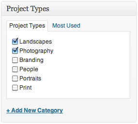 You can assign project types to your project on a project edit screen. Go to Portfolio, choose the project you wish to edit or create a new one. On the right hand side there is Project Types widget, where you can choose relevant project types.
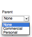 This can be done using hierarchical project types. Go to Portfolio > Project Types and create 2 project types named Personal and Commercial. Next create 4 more project types Travels, Experiments, Fashion and Weddings and make sure you assign their parent setting to either Personal or Commercial project type.
Shortcode: Social Icon
Use social icon shortcode to embed little links to social networks.
Supported Parameters
Supported Icon Names
Social Icon example code: